Here is our Media trailer for "Faces Of Evil".
Wednesday 31 March 2010
Tuesday 30 March 2010
Interview Part 1
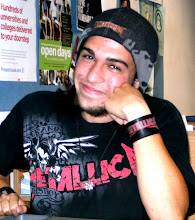
James giving his expression on the project.
This is our audeince feedback, here we learnt what our target audience thinks of our films trailer, poster and magazine.
What we learnt from this interview:
This is our audeince feedback, here we learnt what our target audience thinks of our films trailer, poster and magazine.
What we learnt from this interview:
Thursday 25 March 2010
Editing
The programme we used to edit the film was Windows Movie Maker; the reason we used this particular programme was because I had experience of working with it. We had started off using Adobe Premiere, but I felt this programme was unnecessarily complex for my needs. I have made many short films on Movie Maker which people have given positive feedback to. At first after we had got all our clips, we put them in the order we wanted them to be presented in; after putting the clips in an agreed order, we decided we needed titles in between them, with words that linked the clips together. Once we were happy with the written titles and film clips, we needed music to complete the atmosphere of the trailer. We asked my brother to make a music piece using a computer programme called "Magic Music Maker 7"where he was able to combine instruments to make the main composition. He firstly copied the video so he knew what he had to compose music to, and played the video while he composed the music so he knew whether it would fit or not. We had told him roughly the feel,pace and tone that we felt would complement the trailer. It was then complete. Our trailer is 2 and a half minutes long; although we thought at first it was a bit too long for a trailer,when we looked on Youtube we found many trailers of similar length. Examples are trailers for films such as "Public Enemies", "The Dark Knight" and "The Crazies".
Thursday 18 March 2010
Our Interview
Here is a list of questions we are going to ask pupils in the Sixth Form at William Parker School; our target audience is between 15 - 24, as our film's certification is '15', so there is no point asking younger children as they would not be allowed to watch it, and it is dificult to believe anyone older than that would want to watch a horror film based on teenagers, as they might not be able to relate to the story. The aim of these questions is to find out the pupils' opinions of our film trailer, film poster and film magazine, and having got their views we would know what we would need to improve or change.
INTERVIEW
Trailer
1) What do you think this film is about?
2) Would you watch this film at cinema? - Why? Why not?
3) What is your favourite part of trailer?
4) What do you think could be improved?
Poster
5) Do you know what genre this film is by looking at the poster?
6) From looking at the poster, what do you think the film is about?
Magazine
7) Would you buy this magazine?
8) What do you think of the price of the magazine?
9) What do you think of the layout/colour/images?
10) Overall opinion of the magazine?
All Three
11) Overall opinion of the project?
12) Favourite out of all three? (Trailer, poster, magazine)
13) Do they work together?
Tuesday 2 February 2010
My Sight and Sound Magazine Cover
 This is my final design for the Sight and Sound magazine. The main image recurs throughout the film as a class photo. It is a significant part of our trailer/movie as during both, whenever someone gets killed, their picture gets crossed off in red pen in this photo. So the image is taken from the trailer/ film itself, rather than being produced just for the magazine. The image is too innocent in itself to put on the front cover, due to the fact that it is a lighthearted, casual, bright photograph of smiling young people. From the photo alone the reader would not be able to tell it is a horror film, so to make the image more sinister, I put a shade of blood red in the background. This is to imply a sense of danger or violence, so the audience starts to feel that this isn't in fact a happy school drama film, and is indeed rather the opposite. On the left hand side of the magazine there is a brief contents listing for this issue - in big white words that stand out you can see the word "Plus" showing what extras are in the magazine. The words below are in a clear white bold font, nothing fancy, so the reader can easily see what is written and tell what is inside. It works also in showing up clearly against the black that is behind it.
The contents of the magazine are interviews with various actors/directors, all British to add to the British theme of this 'Special' issue. Just below this you can see the Union Jack flag and on it the words "British Special" so the reader can easily see it is an issue based just on British films and film industy. The sub heading below the words "British Special" says "Amateur film makers", e.g my group and I, "shock Britian with..." - this is to show it is a national production and not a blockbuster hit in America. Then I decided to use the same font for the title of the film that I did in the film poster, ie in the bold white writing at the bottom right of the magazine. At first the writing didn't stand out clearly enough against the background, and as the title of the film was vital to make it stand out more, I placed a dark red blood splat just behind the film title. It also adds another horror effect to the image.
Subscribe to:
Posts (Atom)